Graphic Design I - Recap and Reflection
Prior to taking this course, I was a self-taught graphic designer for about 6 years. I had been doing freelance work across many industries and for many types of designs. I came into it knowing that graphic design was not a new skill to me, but hopeful that I’d be able to improve the skills I had.
One thing I really appreciated in this course was that the instructor really took a big-picture look at the needs of our specific class and restructured almost the whole curriculum around what would best help our class improve. In doing so, he opted to make the final project a mock client project to design a logo and brochure. I won’t share too much of that particular project here because it has a home in my portfolio, but all of the projects leading up to that were designed to give us plenty of opportunities to carry out the design process from ideation to completion.
I want to use this space to reflect on and share those projects because while they aren’t necessarily “portfolio-worthy” pieces, they did provide me a lot of opportunities to learn and improve because I pushed my creative limits and skills a lot more than was expected of me.
Side Note: I used Miro for the bulk of these projects to organize my creative process. I’ve used this for the past several semesters and it has quickly become my tool of choice (though FigJam holds a close second place spot) for visualizing and brainstorming. It really helps me follow the flow of a project and see a lot of well-organized information in one place.
Inspirational Poster
The concept for this was to design a poster that was centered around some type of quote. By this point in the class, I was recognizing that it was a very beginning graphic design course and I was going to need to challenge myself in other ways to grow my skills.
Reflection
In starting this project, I knew I wanted a fun graphic that would be sharable and a quote that was relevant to what I’ve spent time studying in my degree program. I focused on keeping it a lot more simple so that the focus would be on the quote. To challenge myself a bit more than the assignment required, I opted to work with photoshop for my shapes instead of illustrator, which is normally where I would create something like this. I also focused on challenging myself in drawing sketches before diving into a design tool. Sketching has always been something I don’t really enjoy, but I’ve definitely come to see the value in it and will continue to embrace it in my work.
Personal Flag
The concept for this project was to design a flag that represented you as a person.
Reflection
I’m happy with what I came up with for the flat flag, but when it came to making the “waving” flag, there are several things I would want to go back and put more time into. Creating a more realistic-looking grommet and a more realistic-looking flag pole are the two main ones. I also ended up with some artifacts in the mountain scene when I started warping the shape of the flag that I didn’t quite have time to revise.
Key Learnings
There is always room to grow and improve in your design work.
To prevent the artifacts, I could have created the wavy flag with an image instead of the actual illustrator layered file.
Knowing when to let a project lie, even in its imperfections, is an important skill. I knew I did not have the time to work longer on achieving perfection in this project, and that it wouldn’t have been a good investment of my time.
Travel Poster
The concept for this assignment was to develop a travel poster for an imaginary location of our choice.
Reflection
In starting this assignment, I was unsure of what a travel poster most commonly is, so I began by looking at different travel posters to see what the intention or purpose of one even was. I discovered that most are quite simple and reflect a place and often have a simple, but short tagline.
As I put together my mood board, I found that I was drawn to travel posters that were quite illustrative in style. So I intended to have my travel poster reflect that instead of looking like an actual photograph of a location. I also knew that I wanted to use tropical colors and possibly colors reflective of a sunset.
I had initially put together a more vintage-looking mood board for my travel poster, and really liked some of the arched vintage sunset ideas, but ultimately after I did my sketches, I found that the best ones were more simple in nature and followed the rule of thirds better.
I wanted this poster to reflect summer forever. In my mind, summer encompasses beaches, water, sunshine, palm trees, warmth, and fun.
As I began to take my final sketch into an actual design, I put together a few more reference photos to support the sketch I wanted to create. These were intended to help me visualize the way to create the details. My sketch initially had three palm trees on an island, but as I designed it, I found that I only wanted to use two because of the way it allowed the text to sit in that space nicely. It gave more opportunity for your eye to follow a more centralized point of interest along the right rule of thirds line.
For the typography, I had a more vintage style of type in mind, but I settled on something a little cleaner-looking.
I experimented a bit with the color of the text, with my original idea being to create a sunset-colored gradient across the text, but I felt that it was becoming too much color competing with each other. So I settled on creating a sunset gradient in the shadow of the white text. I felt that it created a little more continuity with the text all being white but the shadow allowing the title text to stand out a little more.
I used this project to practice my skill with drawing in illustrator on my iPad, then brought the design into illustrator on my computer to hone in on the shapes and gradients. I created the gradient for the text shadow in illustrator and then pulled that layer into Photoshop to add to the text shadow. I was back and forth between illustrator and photoshop for a lot of the pieces of this project. The palm trees were from a free graphic that I opened in photoshop, cleaned up and sharpened, then pulled into illustrator to vectorize it so I could manipulate the shape of the island a bit more. I really want to hand trace it in illustrator to get cleaner sharper lines and colors.
Design Thinking Infographic
The concept for this project was to develop an infographic that defines the design thinking process in a visual way.
Reflection
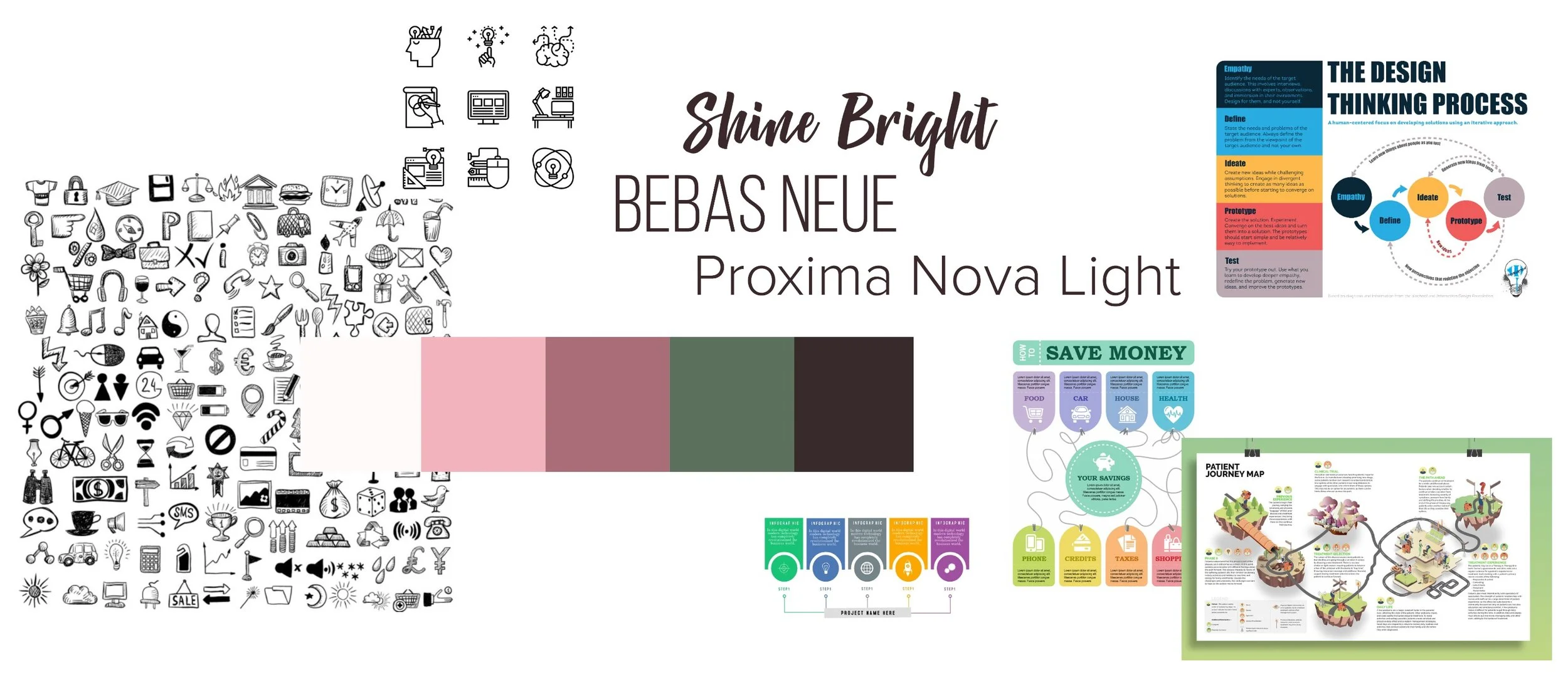
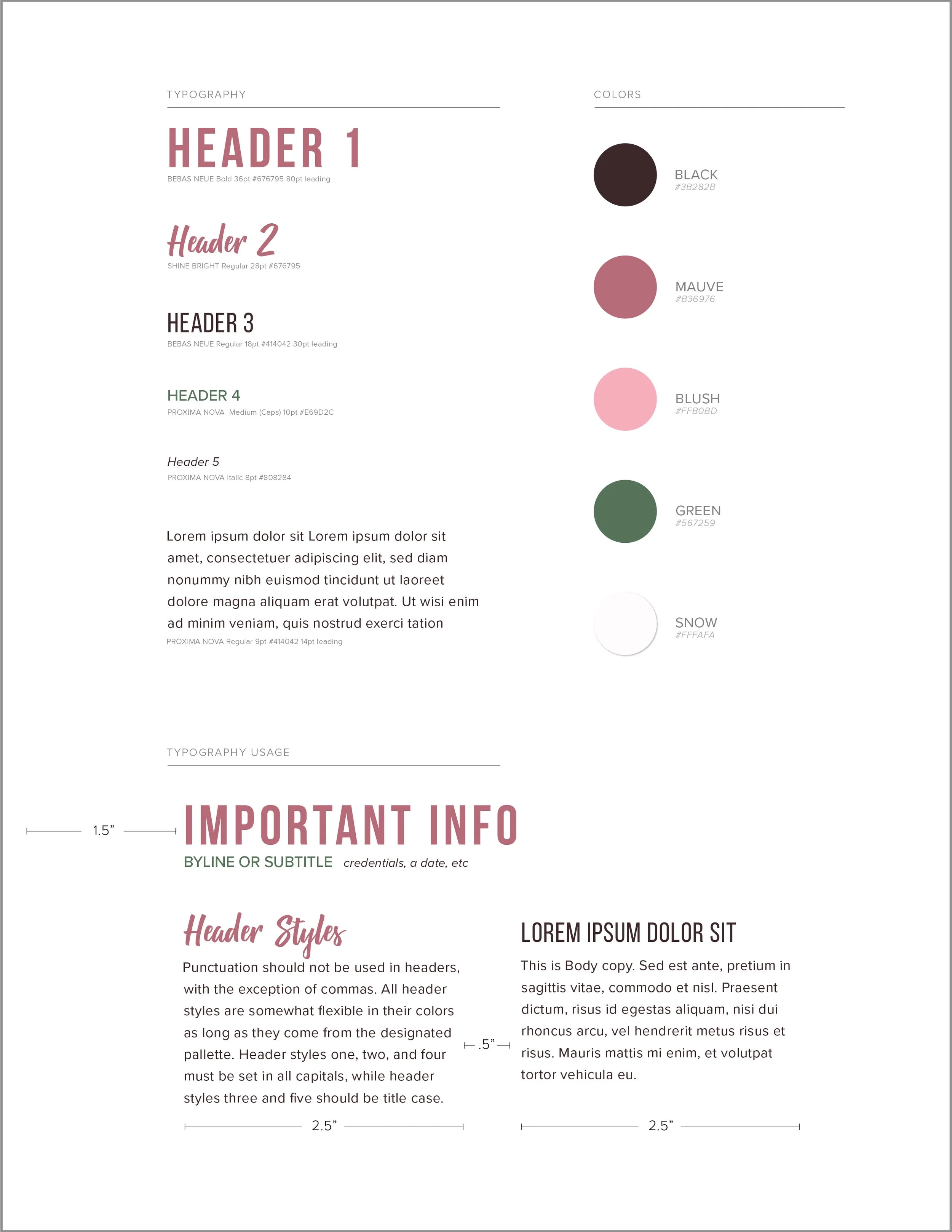
Designing this infographic began with creating a mood board. I made the decision to use my personal brand colors to create it so that it felt cohesive with my portfolio brand. I quickly sketched a few layout ideas and then settled on a final idea from the original three choices.
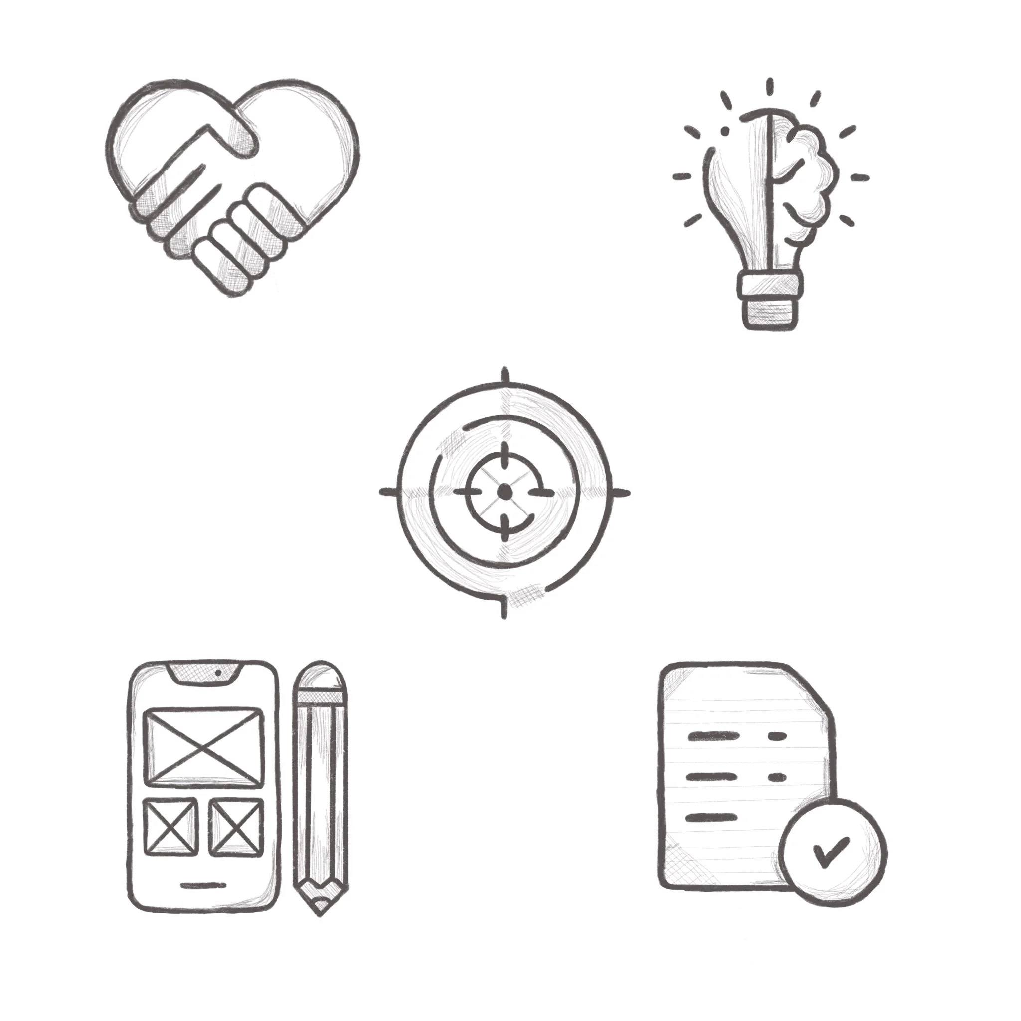
When I began sketching the more refined idea, this is when I solidified the general idea of each icon and created rough sketches of those.
I chose to hand draw the icon elements based on a few icons I found online for inspiration. I wanted them to have a sketched feel, but still be polished. Because human-centered design has such a human element, I wanted to bring that into the design. The final version of each icon was drawn in Procreate on my iPad, and then pulled into Illustrator to vectorize, recolor, and polish the design for the final infographic.
My fonts were chosen based on having a good combination of a decorative font, paired with simple fonts that are also the fonts I use for my personal brand.
I kept all the shapes cohesive by rounding the corners and having soft curves across the whole design to complement the blocky square nature of the fonts. The contrast between those two is visually pleasing to look at.


