


Brand and Brochure Design

Timeline: July - August 2022
Role: Design
Background
Alias Fitness is a conceptual brand born from a graphic design project assignment. The assignment began with five name options to develop a brand around. I chose to build a story for Alias Fitness to move forward with the project.
When I think about fitness brands, most of them aren’t selling themselves well. They are selling physical appearance and diets. My hunch was that isn’t what people actually want in seeking out a fitness brand. What they want is a new version of themselves - which often is deeper than physical appearance and diets, but can include those things. This is why so many brands center a marketing campaign around a “new you”.

Goal
Create a modern fitness brand centered around the “new you” concept.
An alias is an alternate identity. Pursuing a fitness journey is akin to creating a new identity for yourself. You are still you, but your belief systems and lifestyle can change.
Process
The first stage of the process started with developing a logo and style guide for the brand.
I created an initial mood board in Miro to explore ideas and concepts around logos, typefaces, graphic elements, and color palettes. This project worked with a hypothetical client (my design professor) where very little insight into the “business” or “client” was given. I created a mood board with a lot of variety so I could begin to visualize this brand’s story.

Feedback
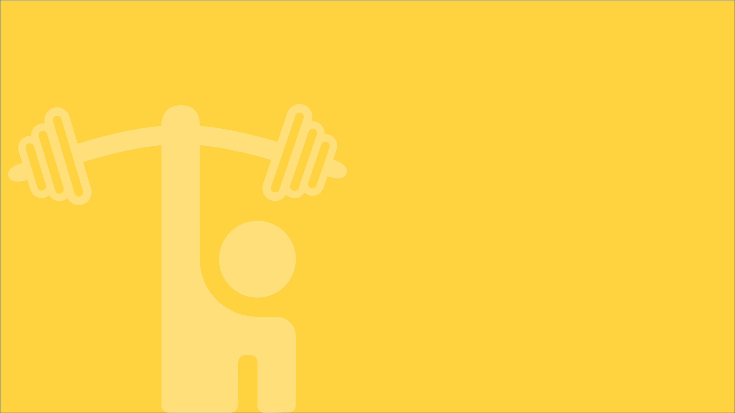
For the branding, I appreciate the variety that you have given me! I find that I am drawn to the bottom-most color scheme, as I like the range of contrast that it provides. I also really like the guy holding the barbell above his head and the simple dumbbell to his immediate right and would like to see some iterative sketches of those two concepts. I really like the blocky typefaces, like the one found on MYELITEPT, and I think the TARWATE fitness typeface could be interesting as well. I am also open to exploring some wordmark options, like the JAKE FITT logo and text, if you would like to give me some sketch options with that concept. Looks great, thanks!
The feedback led me to a clearer direction on what the hypothetical client liked - “blocky typefaces and wordmark options”. I put together some more defined typeface pairings and some initial logo sketches.
Feedback
As for the logo, I am a fan of the leftmost design on the second row, it seems to have a nice balance using the rule of thirds and I like the landscape orientation vs. a vertical orientation with that particular design. It seems like Hanover or Discgent typeface and their pairings would look the best, and I will leave that one to you to decide between. Nice job!
Taking the feedback for the logo design, I moved forward with the design they liked best, but as I designed, I felt that it needed more contrast, so I opted for hollow weights and used the same “outlined” feel for “fitness” to help create balance.
This is the finalized style guide.

Brochure Design
After completing the style guide and brand feel, I moved to create a mood board more specific to the brochure. I carried forward some elements from the initial mood board and found a few layout and style options to present.

Feedback
I love the logo and style guide. Softening the text and outlining the bottom text really does tie everything together cohesively. Great work as always. As for the brochure design, I am ok with whatever direction that you would like to run with it, though I do like the splash vibe of the top right selection of your mood board.
The client mentioned being drawn to the “splash vibe” on the mood board. They gave me creative freedom, so I used this feedback to create some style and layout sketches for the brochure. I opted to include some other layout inspiration from the mood board as well.

Feedback
I think that I like a combination of the top left for the front and the bottom center for the back. I like the diamonds, they seem to counterpoint the blobs/splashes and create a contrast of shapes and textures. I look forward to seeing the finished result!
As I moved into the final step of completing the brochure design, I brainstormed some hypothetical content that I planned to include and dropped it into a Miro board. The client did not provide content, but I always try to include relevant content because it paints a better picture of a finished product. It also helps inform design-related decisions around spacing when I have an idea of what might be included.
My design was created in Adobe InDesign starting with wireframes of the initial sketches and then taking those wireframes to the completed design.

Outcome
Deliverables were a complete logo design and style guide and a brochure design.


Next steps & Learnings
Brand development includes far more than a simple logo and brochure design. The opportunities to design other supplemental pieces for this brand are endless. A website design would be the next project I might create for Alias Fitness. I would also work to finalize the actual content in the brochure.
Working through a brand design without any insight into the brand direction really confirmed through my freelance work that my process involving a lot more target client insight helps develop a stronger brand. This is the main reason I found myself needing to create a fictional story around the brand and use that to drive decisions. For this project, it was acceptable to simply use “Lorem Ipsum” text as placeholder text in the brochure, and it was not a requirement to develop a brand story, but I opted to go the extra mile and develop it at least partially.