
Southern Utah Dog Sports - Brand Redesign
Background Information
Southern Utah Dog Sports provides a place for dog owners and dog sport enthusiasts to connect, learn, and create deeper bonds with their dogs (I prefer to call them four-legged family members). I recently discovered dog agility and felt a pull to it from the moment I started watching it. I aspire to create a bond with my own dog similar to what I have seen from these agility experts. I joined SUDS as a member and fell head over heels for the sport of agility.
Organization Research
Mission (Unofficial)
We provide classes and community for dog sport enthusiasts - from first-time dog owners to professional dog trainers. We strive to create a place where everyone is welcome and can have fun with their dogs. The ultimate goal is to build confidence in your dog and a stronger bond between dog and owner.
Admittedly, this organization does not actually have a mission statement, but because I have spent some time as a member, I was able to see what they were all about firsthand.
They provide a range of classes, video test sessions for training, open practices, group events, parties, events, demonstrations, mini-seminars, a private field that members are allowed to use for practice with equipment, and more.
Their board consists of members that collectively have extensive experience with dog sports and training.
They are the only group of this kind in the Southern Utah area.
Existing Imagery & Design


Empathy Map

Mood Board

Hand Sketches


Digital Sketches
Of the sketches I created, I chose three of the sketches I felt best captured the words from the mind map I created; fun, community, and connection to dogs. I created some additional iterations derived from those logos and then picked a few of those to create digital sketches.

Type Focused
I wanted to create some variety in digital sketches that still fit the criteria, so I opted to include a word-based logo, with some appropriate symbols.
Shield
A shield represented sports to me, but I wanted to still include an element showing connection to dogs.


Heart
I felt that a heart really represented love and connection to your dog - especially with the paw print. It also has an element of fun with the angle of the banner.
Revised Digital Sketches
I continued to iterate on the initial digital designs. One change I made was bringing back the mountains as a nod to the original logo design. I also opted to experiment with some fonts that felt playful and similar to those on the mood board. I settled on simpler fonts because the logo design itself has quite a bit of detail to it.

Color Experimentation

I experimented with colors based on the mood board and the feel I wanted to achieve with this brand. The important things were to keep it playful, without being too masculine or feminine because the organization does have a diverse group of members. I also wanted to ensure that there was contrast across the palette. I settled on the bottom palette from the left, and expanded it across different saturation and brightness ranges. I also developed a black and gray scheme to coordinate.
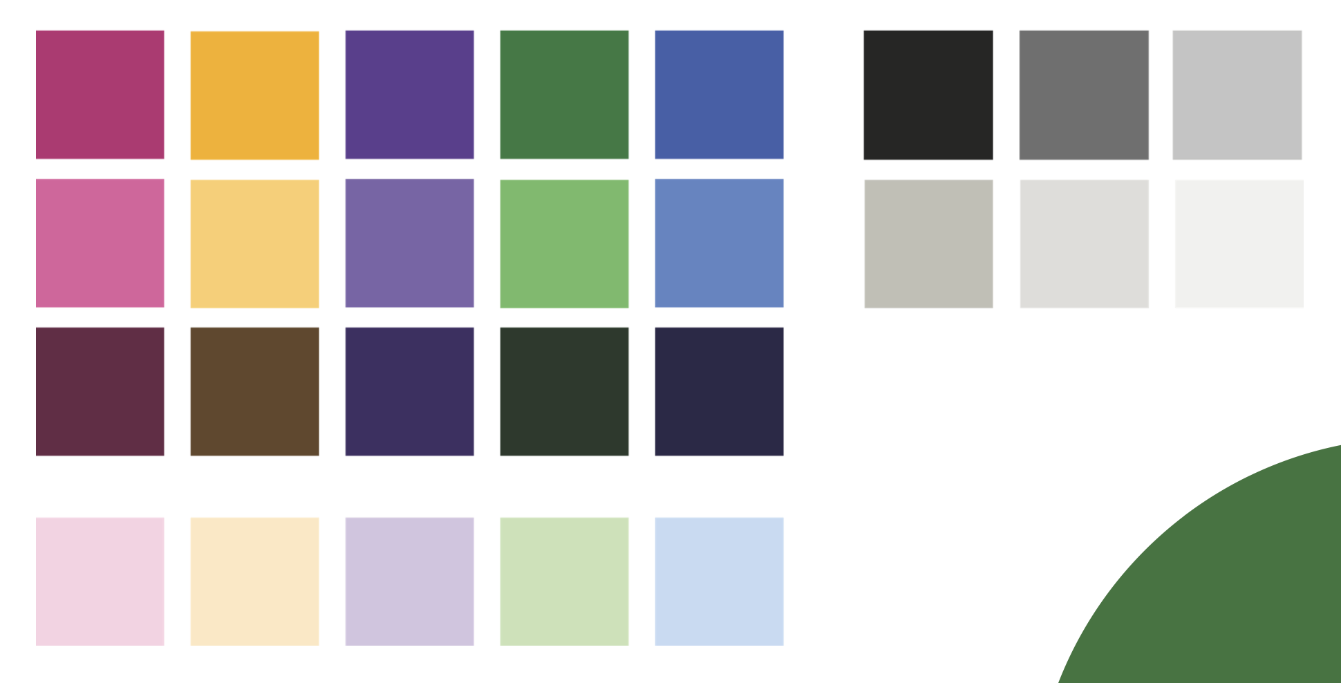
Color Exploration
After settling on a color palette, I opted to experiment with color options for the final logo designs I selected. I stuck with the base colors for the starting point of logo colors. I also experimented with outlining certain parts of the logo to enhance contrast and drive focus to different parts of the logo. In experimenting, I opted to narrow down to a single logo and coordinating, simplified wordmark.
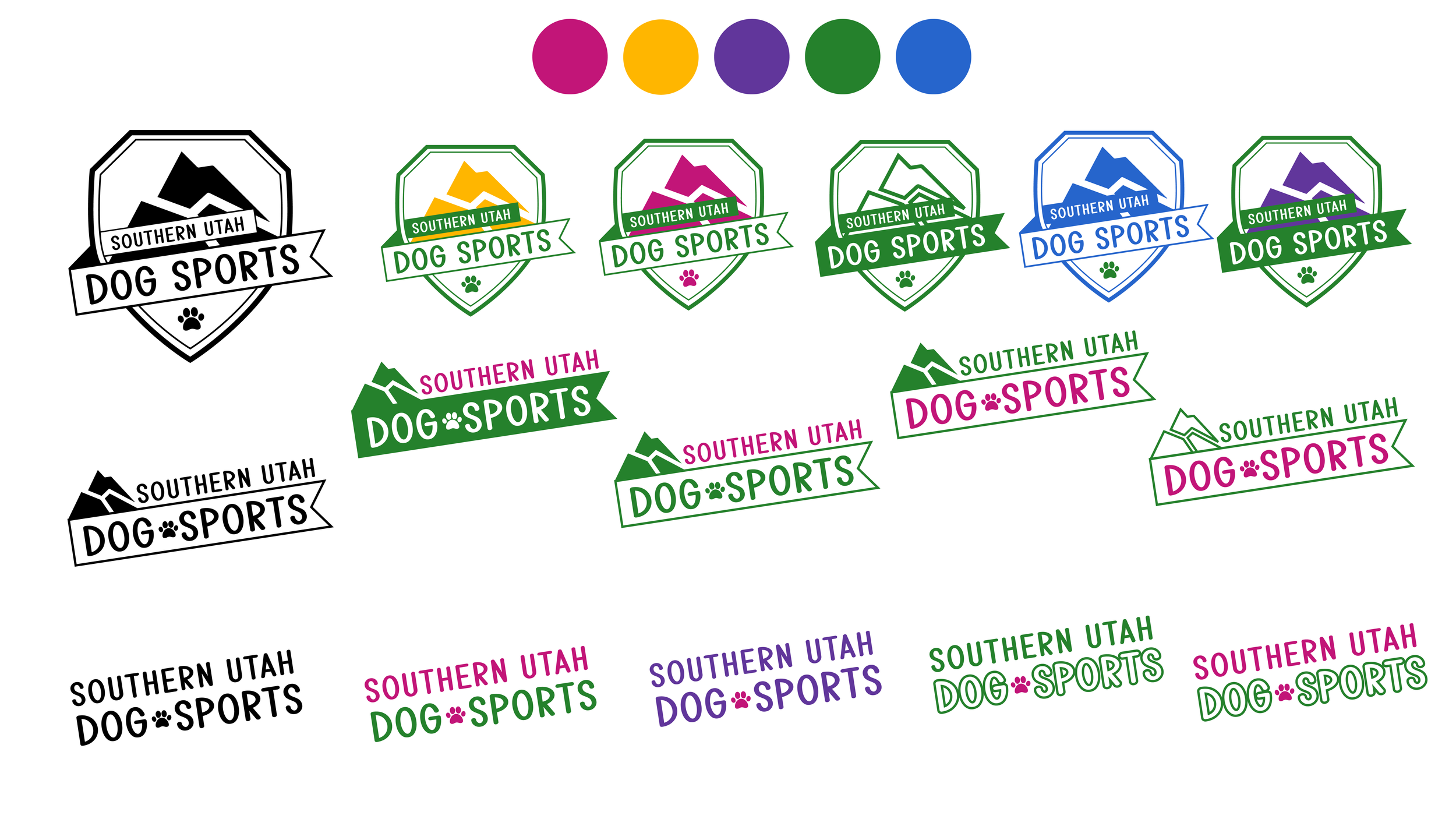
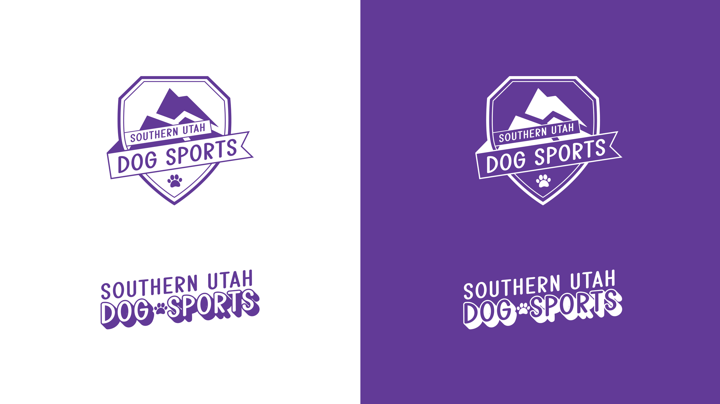
Final Logo Design
For the final logo, I had settled on the badge version with a few revisions. I felt like the shield logo had the best contrast when the banners were knocked out and the mountains in the background were solid. It also showcased more dimension and depth in this design.
Another change I made was to shear and slat the text instead of just rotate it because it brought a sportier sense of movement to the design. I also chose to add a deep shadow to the wordmark because when placed against the shield, it felt like it lacked contrast. I wanted the dog sports portion of the name to be bolder, but still unique. In the interest of keeping the text design the same in both logos, I also changed the wordmark to a shear and slant instead of a rotational tilt.
With the banner knocked out, it keeps the logo all one simple color, but doesn’t lose the dimension and allows it to be used in any of the primary brand colors with ease.
Process Book

I assembled the contents of this project into a PDF book documenting my process. You can download the PDF by clicking the photo.