Brand & Logo Design
This client reached out to me to design a logo for her personal brand and coaching business. She coaches women in business to build a business that is authentic to them and, naturally, that meant it was important for her to have a brand that was authentic to her. This design incorporated a logo and color scheme along with a visual identity for the brand. My goals in designing her logo were:
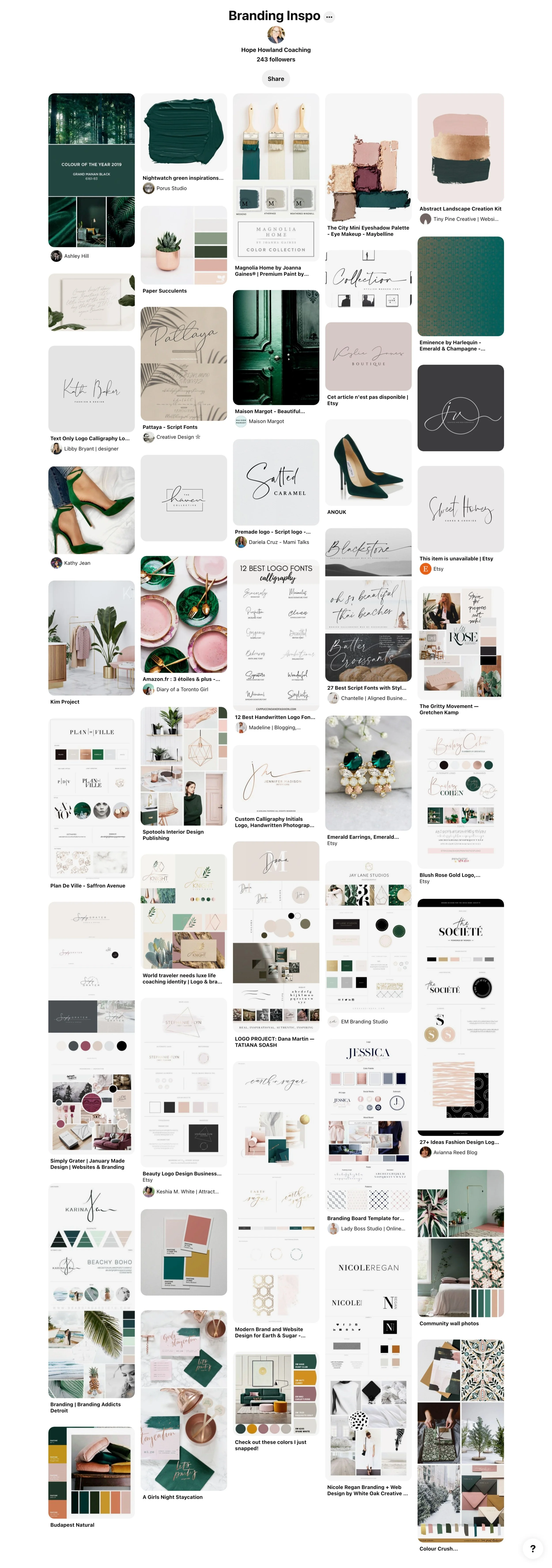
Design a brand that captured the vision on the client’s Pinterest board
Authentic to them
Clean, magazine-esque (I know it’s not a word, but just go with me), high-end vibe
In Brand and Logo Designs I always start with a logo design based upon the inspiration and vibe in their Pinterest board – as long as it’s cohesive with their overall brand vision and makes sense with their business direction.
In her Pinterest board, I definitely saw a clean, high-end vibe, and where logos were concerned, the feel was clean, script typography-based logos - which I happen to LOVE designing. So I started with simple black logo sets for her. I had a feeling her logo would stay black, but even if a client wants a color logo, I always design in black first - because a logo should not need color to be appealing. If it relies on color to “work”, it doesn’t actually work. This was the first round of logos I sent for review.
My thought process when sending logos is to send three and get feedback, then tweak and send three more, and so on. With this client, I sent six logos to start because I felt she already had a really good direction she was trying to go. Most clients aren’t quite as clear at this stage. 😊 The Pinterest board gives a good starting point, but often (especially with name typography logos) you realize a font that works for someone else’s name might not work for yours. So until you see a starting point for your name, it can be difficult to be clear about what you like and don’t like. I also try to keep the first set of logos full of variety, and then once I know which ones appeal the most to them, I narrow it down and start to show more subtle changes.
From the first set, she said numbers 3, 5, and 6 were her favorites. Her specific feedback helped me get a clearer picture of what she liked. When looking at those three together, it became clear she liked a less structured-looking logo, and she wasn’t drawn to the bolder fonts. Designers often feel insulted when clients don’t like something about their work, but a client expressing something they don’t like is just as important as what they do. And you learn to read between the lines.
This is the second round of logos I sent.
In the second round, I focused more on imperfect, handwritten script fonts in different arrangements. Instead of changing too much about the designs, I gave more subtle differences in font choices along the lines of the fonts she was drawn to. From this round, she said she loved numbers 2 and 3 - with a preference for 2. That gave me insight that between those two, she liked an all script version.
This is the next set of logos I sent.
In the third round, the only changes were font and arrangement of lettering to suit the font choices best. Because of this, I opted to label each logo with the font used. This is typically the point where we go deeper into color choices, but this client fell in love with the first color palette I sent, so, there was no further process with that.
The final visual brand identity board included some additional elements to help give direction when creating supplemental designs.
This is the final visual brand identity created for this client.


